Picture this: You’re scrolling through your social media feed when suddenly, a stunning picture of a black hole stops you mid-scroll. Or you’re flipping through a magazine and a beautiful diagram of DNA catches your eye. Sound familiar? That’s the power of science visuals at work. But scientific illustrations aren’t just decorations—they’re fundamental tools crafted by skilled artists that can shape the public understanding of science.
I would like to present three compelling reasons why science communication (now more than ever) demands thoughtful illustrations: their ability to capture attention in our information-saturated world, their ability to explain complex phenomena, and the transformative power of conceptual metaphors. I would also argue that visuals have revolutionized scientific understanding throughout history—and that’s why we must resist the temptation to delegate them to mindless algorithms.
- Attention Revolution
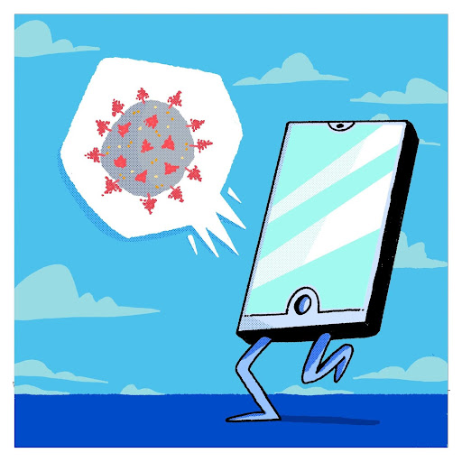
Let’s be honest—we’re drowning in information. Every day, our brains are bombarded with thousands of messages competing for our precious attention. In this cacophony, an eye-catching graphic can cut through the noise like a lighthouse beam through fog. Think back to 2019 when the Event Horizon Telescope collaboration released the first-ever image of a black hole. Or the still eerily familiar image of the COVID Sars-CoV2 virus from the Centers for Disease Control and Prevention. These are images almost everyone around the planet will instantly recognize, regardless of their scientific background.
But here’s what many people forget: these iconic images didn’t just appear out of nowhere. They are not ‘real’ pictures captured by scientific instruments. They required teams of scientists working with visualization experts to transform data into something the human eye could comprehend and the human heart could respond to.
This tradition of scientific illustration spans centuries. Ernst Haeckel‘s intricate biological illustrations from the late 1800s demonstrate this perfectly. His drawings of radiolarians, jellyfish, and other sea organisms sparked public fascination with natural history. These illustrations were based on careful observations but their power lies in the many choices that Haeckel made about symmetry, pattern, and composition that transformed scientific specimens into objects of wonder. Dating even further back, Robert Hooke’s Micrographia with its spectacular illustrations of a flea, a louse, and the cellular structure of cork became the first scientific best-seller, inviting an entire society to see the microscopic world for the first time. These illustrations didn’t require equations or lengthy explanations. They communicated instantly and emotionally in ways that words alone could never achieve.
The lesson is clear: in a world where attention is currency, visuals are the richest denomination. They can stop the endless scroll, spark people’s curiosity and invite them to lean in, and that’s the first battle of every science communicator. But visuals can be much more than just attention-grabbers. They can serve as ‘portals’ into science, providing a conceptual and emotional framework for whatever explanation comes next.
- Explanatory Power: What Words Cannot Tell
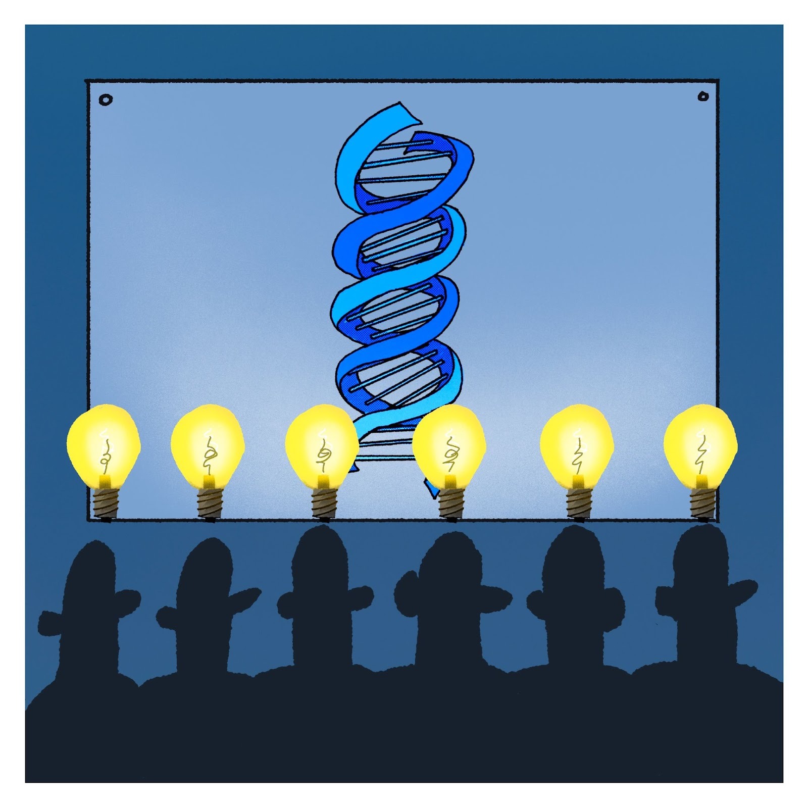
Some scientific concepts are simply impossible to communicate through words alone. Try describing the double helix structure of DNA using only text, and you’ll quickly realize why James Watson and Francis Crick’s 1953 visual model was revolutionary. That elegant spiral structure communicated in an instant what would take paragraphs to inadequately describe.
Here illustrations serve as demonstrations that bridge the gap between abstract concepts and concrete understanding. They don’t just complement explanations; they are explanations. Sometimes in science we literally need to ‘see’ in order to ‘understand’ something. Consider Andreas Vesalius’s groundbreaking anatomical illustrations in his 1543 De Humani Corporis Fabrica. Vesalius worked with skilled Renaissance artists who knew how to guide the viewer’s eye, how to reveal layers of muscle and bone, and how to make the human body both scientifically accurate and aesthetically compelling. These illustrations became teaching tools that revolutionized medical education and corrected centuries of misconceptions. Medical illustration remains a sophisticated art form today. When a medical illustrator creates images of surgical procedures, anatomical structures, or disease processes, they are making countless decisions about what to emphasize, simplify, or omit. What angle reveals the most information? What colors enhance understanding rather than distract?
- Conceptual Metaphors as Thinking Tools
Another kind of visual transcends figurative representation and becomes a thinking tool in itself. The most powerful scientific illustrations don’t just show reality—they provide conceptual frameworks that reshape how we understand the world.
Consider the periodic table, first organized by Dmitri Mendeleev in 1869. While the data was scientific, the visual presentation—how the elements were arranged, spaced, and grouped—was a design choice that revealed patterns in nature. Over decades, illustrators and designers have refined this visualization, adding color coding, atomic diagrams, and visual hierarchies that make the table not just informative but intuitive. Students worldwide don’t just memorize the periodic table; they learn to read it like a map of chemical possibility.
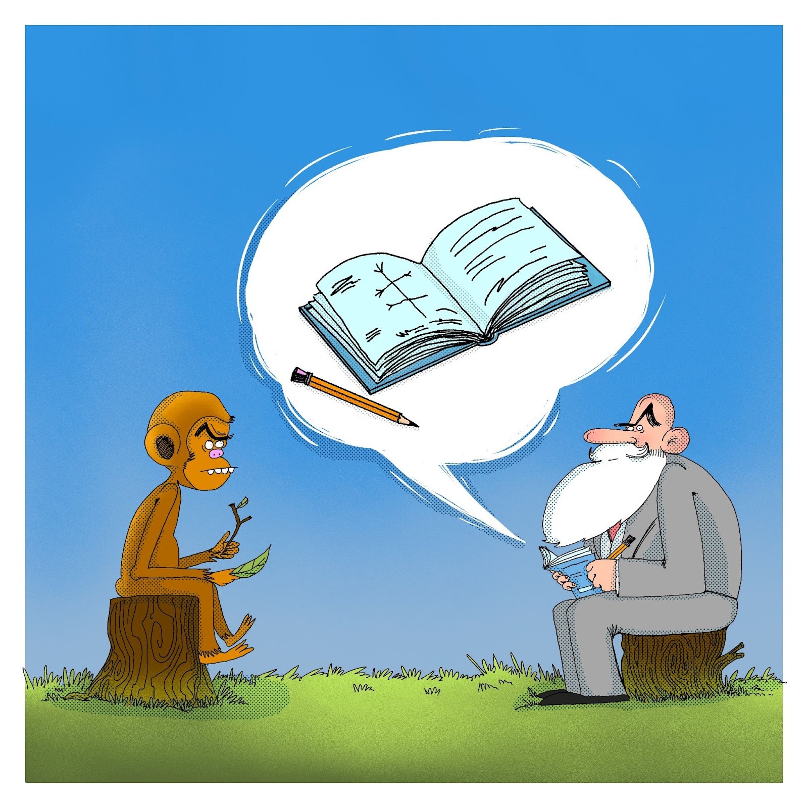
Darwin’s ‘Tree of Life’ sketch from his notebooks provides another profound example. That simple branching diagram revolutionized biology by offering a visual metaphor for evolution. While Darwin was no professional illustrator, his visual framework continues to shape how we conceptualize biodiversity more than 150 years later, refined by scientific illustrators who created the branching diagrams we use today. These visuals allow us to show relationships, time scales, and evolutionary distances in ways that make the abstract concept of deep time comprehensible.
The Human Touch: Why Illustration Matters Now More Than Ever
In conclusion, the history of science communication is inseparable from the history of scientific visualization. From Galileo’s drawings of Jupiter’s moons to Rosalind Franklin’s careful X-ray crystallography images, from the paintings in John James Audubon’s The Birds of America to David Goodsell’s hand-drawn renderings of crowded cellular environments—images have consistently driven our scientific understanding.
But we’re at a crossroads. As AI-generated images become easier to produce, there’s a temptation to replace skilled illustrators with algorithms. This would be a catastrophic mistake for science communication. As I have tried to argue, scientific illustration isn’t just about making something that looks plausible. It’s about making thousands of deliberate choices based on deep understanding of both the science and how humans perceive and learn. AI-generated images, no matter how sophisticated, are fundamentally derivative— they can’t make the intentional choices that transform data into insight. Used carelessly they can also generate misleading illustrations, which undermine trust in science
To be clear: this is not a wholesale rejection of the technology. AI tools can be incredibly useful to the artists (I admit to using them myself) but the tool cannot replace the artisan. Because science communication needs more than just visuals—it needs the human creativity, understanding, and skills that only trained illustrators can provide.
So I ask scientists, science writers, and communicators everywhere to resist the siren song of AI-generated imagery. Instead, invest in human collaborators. Build relationships with technical illustrators, artists, and designers. Share your knowledge with someone who can transform it into visual understanding. Pay artists fairly for their expertise—because scientific illustration is a specialized skill that takes years to develop.
The choice is yours: will you be part of preserving and advancing this crucial tradition, or will you let algorithms flatten one of science’s most powerful communication tools into a sea of lifeless pastiche? The next breakthrough in public science understanding might not come from a new discovery—it might come from an artist’s pen, working in close collaboration with a scientist’s mind. Let’s make sure that partnership thrives.


Leave a Reply